Pie Rewards redefines the realm of loyalty programs. The fundamental concept driving this application is to unite various loyalty programs into a single, user-centric platform. Pie Rewards offers users a distinctive opportunity to invest a portion of their spending's from both in-store and online transactions. These investments are strategically placed in a portfolio of choice, tailored to the user's preferred risk level.

Pie Rewards redefines the realm of loyalty programs. The fundamental concept driving this application is to unite various loyalty programs into a single, user-centric platform. Pie Rewards offers users a distinctive opportunity to invest a portion of their spending's from both in-store and online transactions. These investments are strategically placed in a portfolio of choice, tailored to the user's preferred risk level.

My Role

My Role

Lead Product designer

Lead Product designer

Contribution

Contribution

UI / UX Design

UI / UX Design

Product Duration

Nov 2021 - Feb 2023

Company

Appboxer

Product Duration

Oct 2022 - Feb 2023

Company

Appboxer

Product Duration

Oct 2022 - Feb 2023

Company

Appboxer

The Problem

The Problem

1.

1.

Existing loyalty programs require users to manage multiple cards and memberships, leading to inconvenience and clutter.

Existing loyalty programs require users to manage multiple cards and memberships, leading to inconvenience and clutter.

2.

2.

Many programs cater mainly to big spenders, excluding casual spenders from meaningful benefits.

Many programs cater mainly to big spenders, excluding casual spenders from meaningful benefits.

3.

3.

A significant portion of individuals, including over 50% of Australians, don't actively invest due to barriers and risk aversion.

A significant portion of individuals, including over 50% of Australians, don't actively invest due to barriers and risk aversion.

The Goal

The Goal

1.

1.

How might we simplify and unify the loyalty experience for users while eliminating the need to manage multiple programs?

How might we simplify and unify the loyalty experience for users while eliminating the need to manage multiple programs?

2.

2.

How might we democratize loyalty benefits, ensuring that both frequent and occasional spenders receive meaningful rewards?

How might we democratize loyalty benefits, ensuring that both frequent and occasional spenders receive meaningful rewards?

3.

3.

How might we bridge the gap in investment participation, making it more accessible and appealing to individuals who have not traditionally invested?

How might we bridge the gap in investment participation, making it more accessible and appealing to individuals who have not traditionally invested?

Starting the mapping with flow chats

Starting the mapping with flow chats

Completed by Solutions analyst in collaboration with myself

Completed by Solutions analyst in collaboration with myself

Following the initial ideation session, a pivotal step in the development of Pie Rewards involved strategically outlining the functionalities that would constitute the Minimum Viable Product, as well as those earmarked for subsequent phases. The collective decision was to prioritize certain features, notably the seamless investment process on behalf of users, and the meticulous establishment of fundamental functions. Among these fundamental aspects, careful consideration was given to API integration, ensuring a seamless connection with users' credit cards for a seamless experience. This strategic approach allowed us to craft a focused and impactful MVP that lays the foundation for Pie Rewards' innovative and user-centred trajectory.

Designing the functionality & form

Designing the functionality & form

Completed by myself

Completed by myself

During the wireframing phase, a pivotal stage in the development of Pie Rewards, we solidified our choice of API provider. This entailed addressing a plethora of UI requirements mandated by the chosen API provider. As I delved into creating the wireframes, I seamlessly integrated these specifications, ensuring a harmonious alignment between the UI design and the API capabilities. Throughout this process, I remained committed to adhering to the best UX practices, marrying functionality with usability to craft an intuitive and visually coherent user experience.

During the wireframing phase, a pivotal stage in the development of Pie Rewards, we solidified our choice of API provider. This entailed addressing a plethora of UI requirements mandated by the chosen API provider. As I delved into creating the wireframes, I seamlessly integrated these specifications, ensuring a harmonious alignment between the UI design and the API capabilities. Throughout this process, I remained committed to adhering to the best UX practices, marrying functionality with usability to craft an intuitive and visually coherent user experience.

Usability study: findings

Usability study: findings

Completed by myself

Completed by myself

1.

1.

Users sought a withdrawal process that offers more customization, allowing them to select specific investments to withdraw from.

Users sought a withdrawal process that offers more customization, allowing them to select specific investments to withdraw from.

2.

2.

Users faced difficulty distinguishing between in-store and online offers.

Users faced difficulty distinguishing between in-store and online offers.

Accessibility: Distinguishing In-Store and Online Offers

Accessibility: Distinguishing In-Store and Online Offers

Completed by myself

Completed by myself

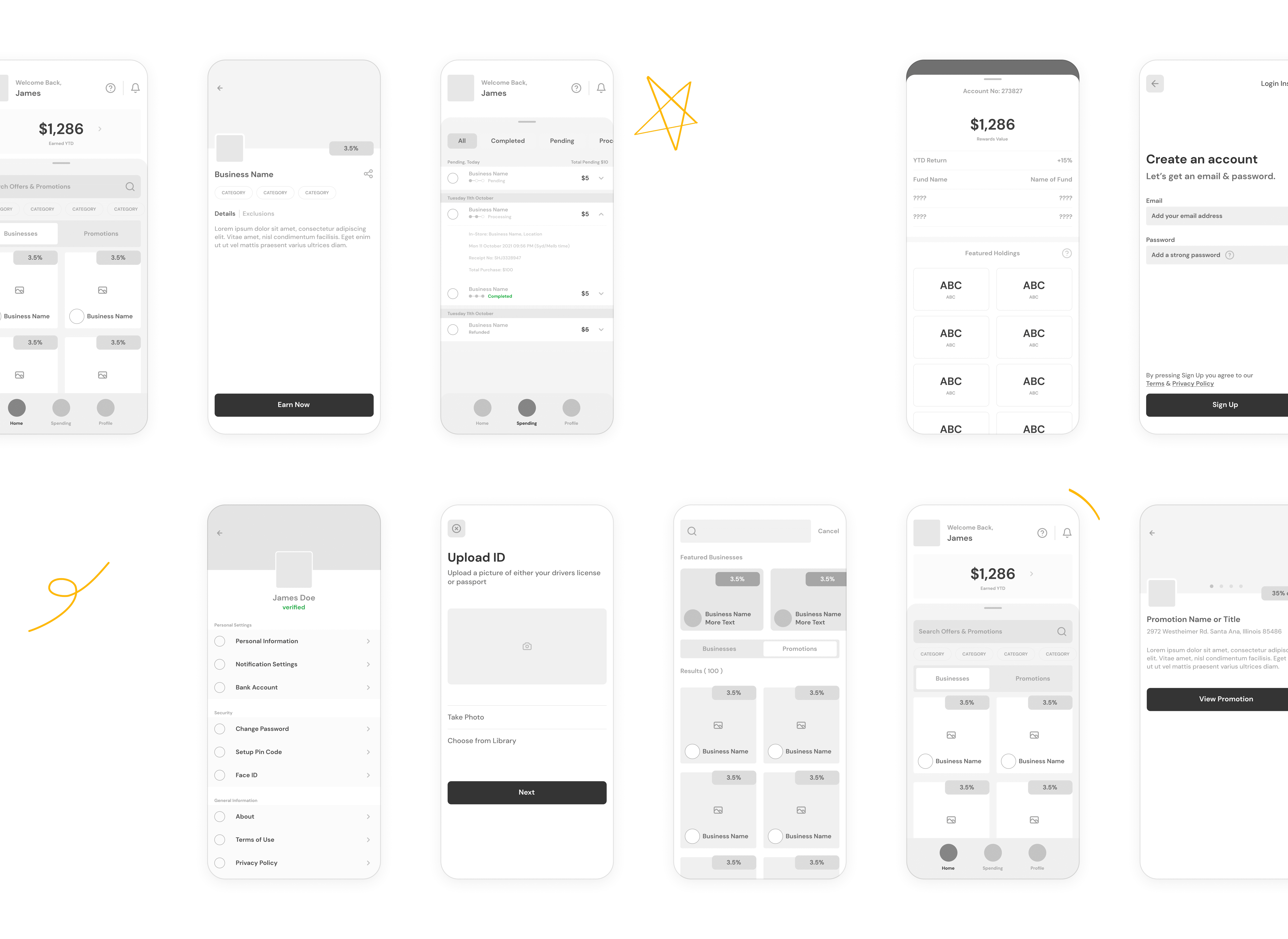
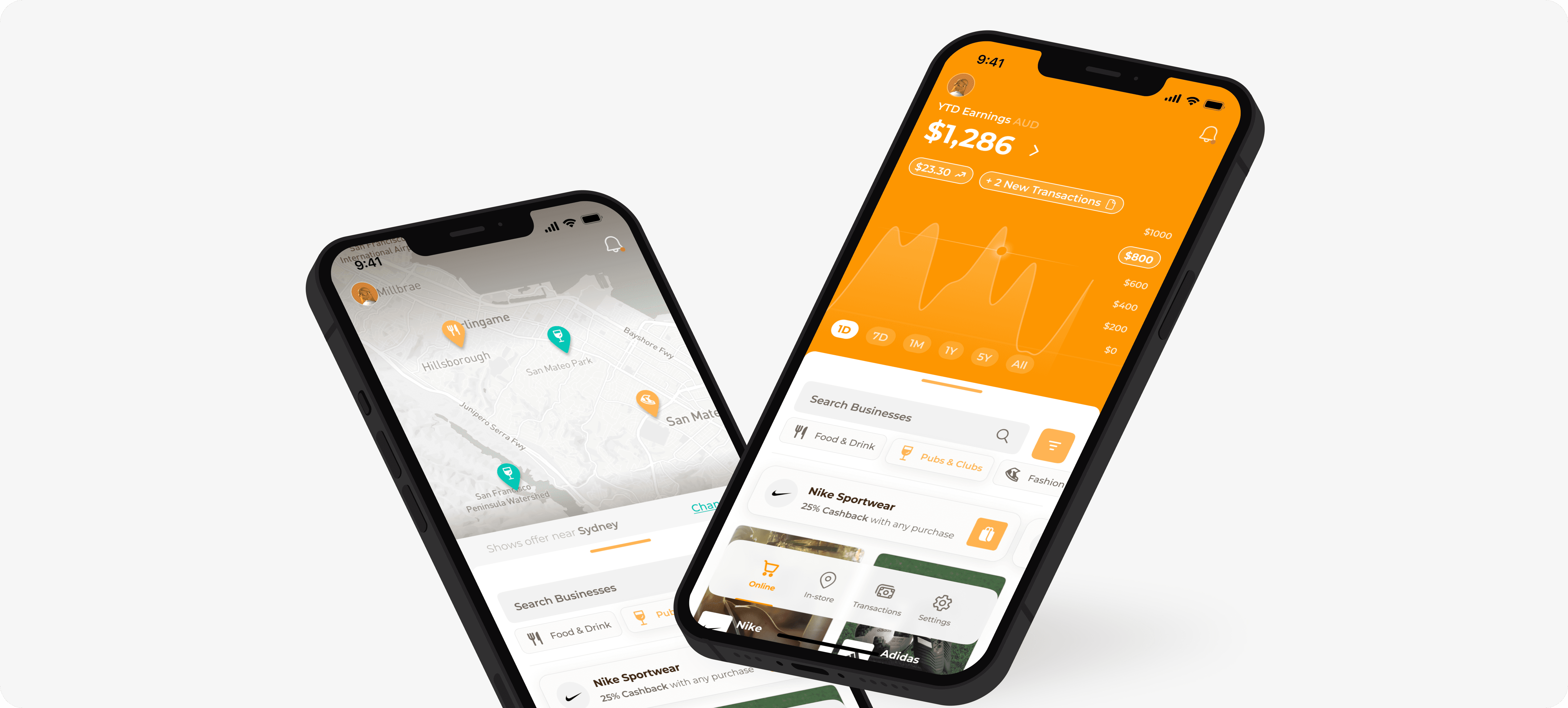
A notable enhancement was the dedicated segregation of in-store and online offers. This critical modification aimed to address a user challenge. Initially, differentiation between these two offer types relied solely on iconography. However, as part of the design refinement process, separate navigation items were introduced, ensuring clear demarcation between in-store and online offers. In addition, for in-store offers, a dynamic map view was incorporated, providing users with a visual representation of all available offers within their vicinity. This strategic alteration amplifies user clarity and navigation, simplifying the process of exploring and engaging with the diverse range of offers offered by Pie Rewards.

Empowering Investment Control: Enhanced Withdrawal Process

Empowering Investment Control: Enhanced Withdrawal Process

Completed by myself

Completed by myself

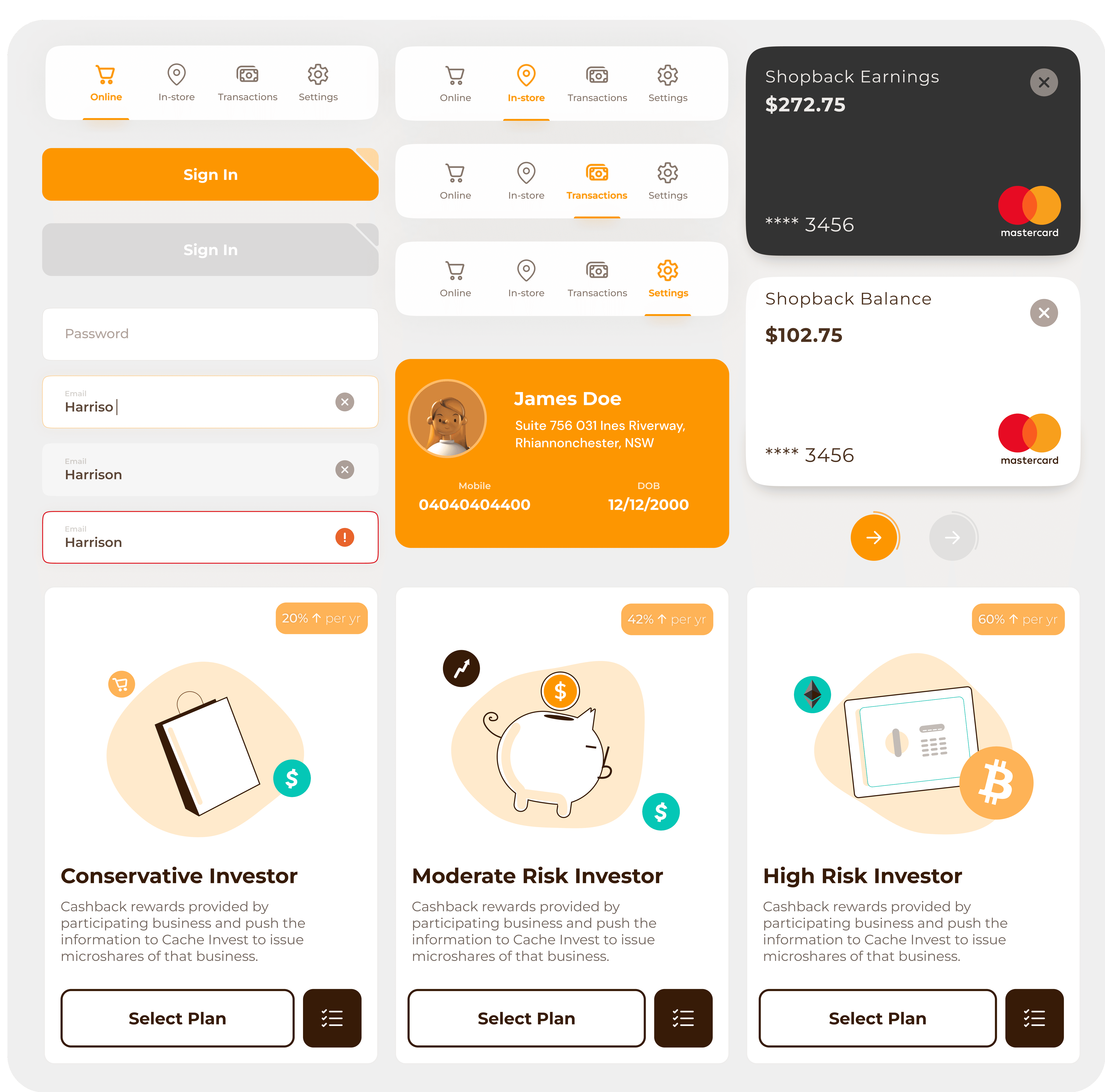
Originally, users withdrew funds from a collective pool of investments. While users could select their preferred portfolio type, they were also provided the option to supplement their investments with choices like Bicton and Big Tech. The previous procedure evenly distributed users' invested funds across all their chosen investments, resulting in an even withdrawal. However, the usability study indicated that users desired the flexibility to pick specific investments for withdrawal. In response, the design underwent refinements to align more closely with users' preferences and needs.

Extending Reach: Enhance the Online Shopping Experience with a Browser Extension

Extending Reach: Enhance the Online Shopping Experience with a Browser Extension

Completed by myself

Completed by myself

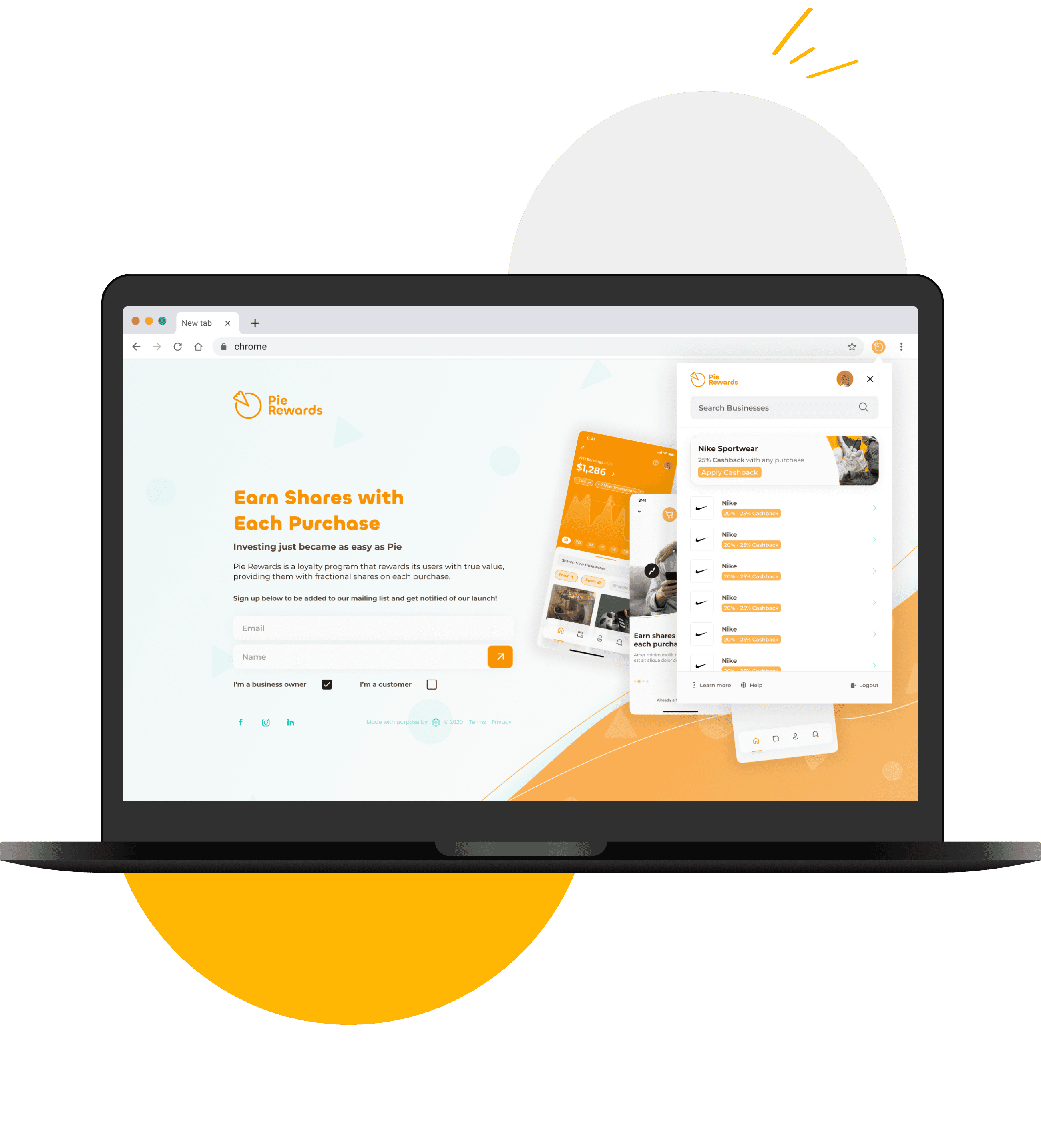
During a later phase, the client expressed interest in expanding Pie Rewards' reach to the web, acknowledging the substantial portion of users who conduct their online shopping via laptops. In response, I conceptualized and designed a browser extension that encapsulated the core functionalities offered by the app.

Upon logging in, users are presented with a comprehensive list of businesses providing online offers, along with any ongoing cashback offers that are applicable. This browser extension seamlessly aligns with the app's capabilities, offering users a streamlined experience while shopping online through their laptops, thereby broadening Pie Rewards' accessibility and convenience.

Crafting Consistency: A Design System for Seamless UI

Crafting Consistency: A Design System for Seamless UI

Completed by myself

Completed by myself

Creating the UI design involved developing a comprehensive design system that encapsulates multiple states for components and inputs. This design system serves as a foundation for maintaining consistency and coherence throughout the application, ensuring a seamless and polished user experience. By carefully defining various states for each component and input, I aimed to enhance user interaction and feedback, making the application more intuitive and user-friendly.

Additional designs

Additional designs

Completed by myself

Completed by myself

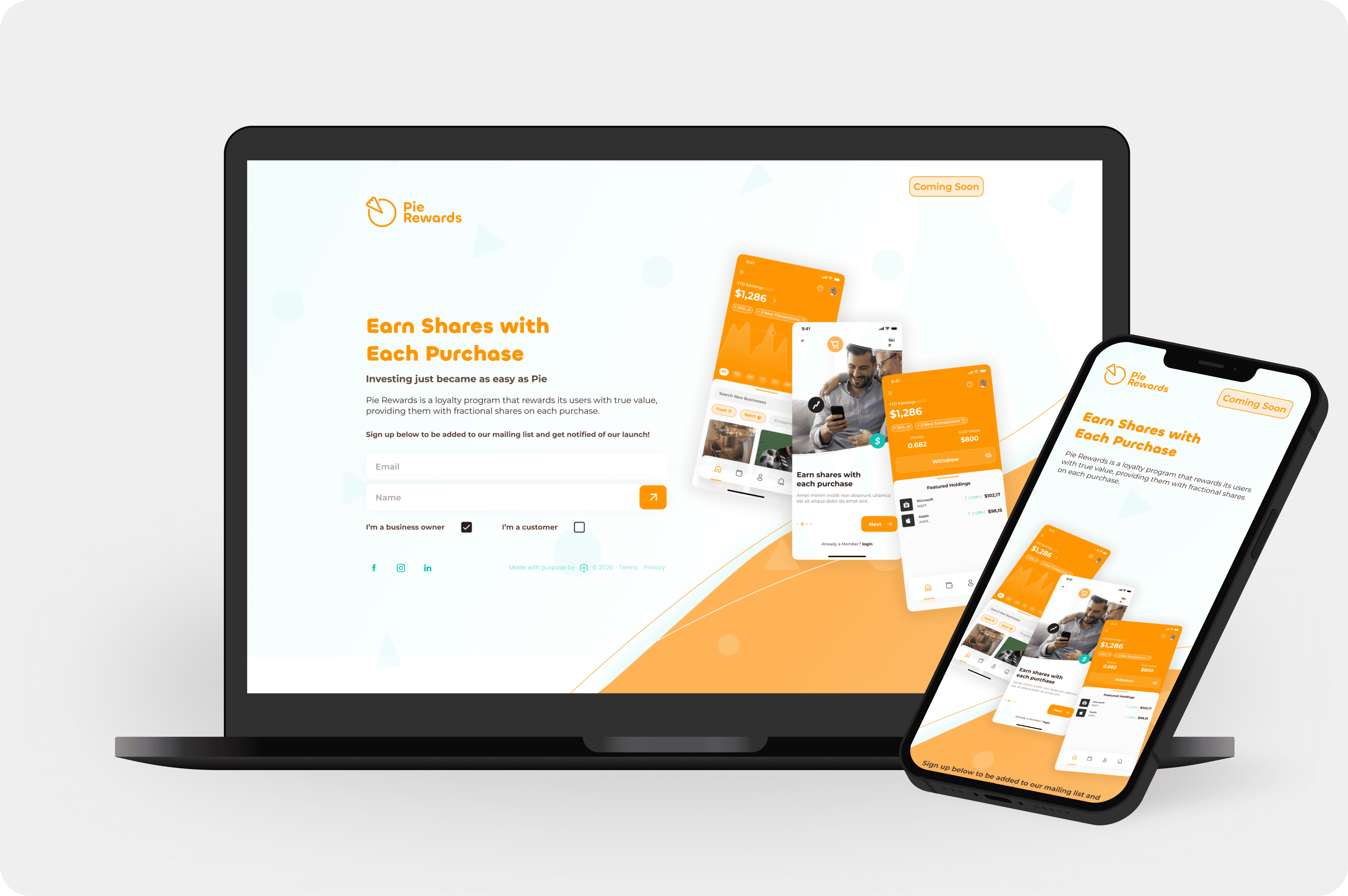
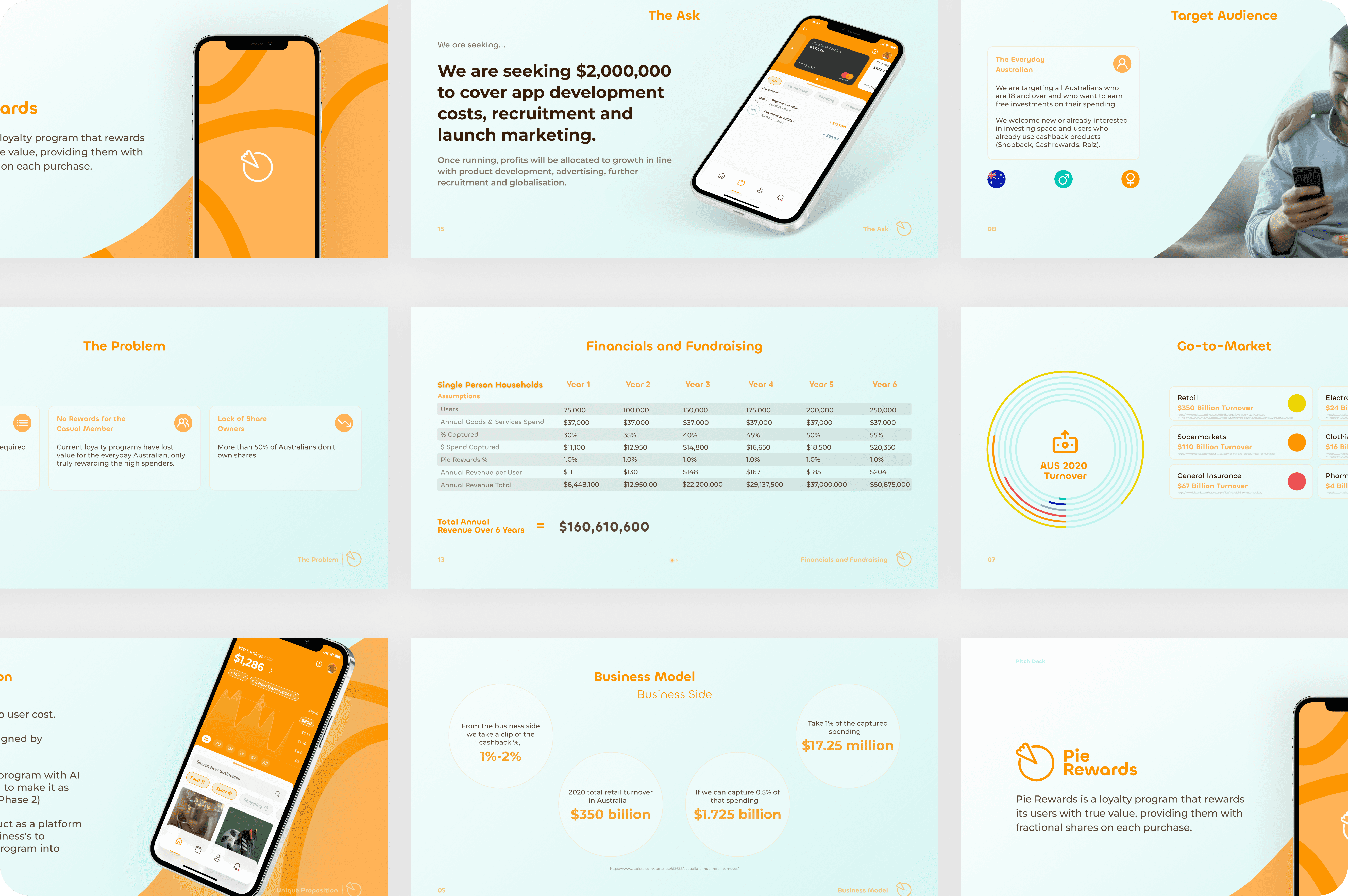
In addition to the UI design for the main application, the project also involved creating a captivating landing page to register initial user interest and a persuasive pitch deck to seek investment from potential stakeholders. These design components played a crucial role in establishing a cohesive and impactful brand presence for the project.